With the advent of myriad of health apps geared toward addressing the mental wellness of users, there arose a concern that many of these apps may be failing to factor the human element of their services. Issues such as data privacy, in-app costs, and the failure to address user's immediate needs.
While these apps provide both traditional and newer forms of therapeutic activities and features, the user may struggle to digitally access the relevant necessities in moments of crisis or despair. Yes, meditation may be helpful but for a user experiencing a crisis, the option to reach out for help may be more paramount. In the same vein, a user may want several options presented to them (maybe a meditation session, a "reach out for help" feature, etc), however digital clutter can make matters worse and interrupt the user's journey.
Lastly, stress exists on a spectrum. As such, there is consideration for apps to reflect this. A user may only want to listen to a playlist and, at another time, he/she may want to listen to a specific podcast relating to reducing stress. In short, prioritizing a space that reflects different levels for stress management is ideal.

Challenge and Solution 1: Onboard the user as a caregiver would
One of the main goals of this project is to refocus on the human element: meeting the user where they are. The challenge is that the user can get lost in the myriad of features that wellness apps offer. Streamlined onboarding is key. A user looking for assistance with stress may not take well to seeing a price chart or subscription offer as the first piece of content.
The remedy is simple. Center the individual. The second onboarding screen allows the user to define their stressor.
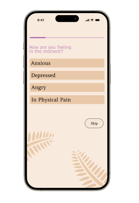
Giving users the opportunity to address their immediate feelings captures the solution of focusing on the human element. This section reflects the approach many mental health professionals use to allow their clients to acknowledge and reflect on their feelings. While it may force clients to address their issue, it paves the way for them to move on to the next step of therapy.
Solution 2: Minimalism
With the option to skip or to tailor their experience, the user is welcomed into a minimalistic space. Here's a pre-customized screen with features arranged in a grid allowing for easy and quick selection. A space where the user can customize additional app features but also having them arranged in a minimalistic fashion guards against clutter and follows standards for mental health app development.
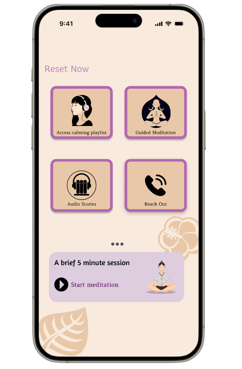

Solution 3: Allowing user to curate space
The example presented here is a playlist. As this app would be presented to the user as a refuge where he/she can destress, it makes sense for their own methods of stress management are "housed" in said space. The playlist example highlights that the user may have a curate a playlist for their own mental health resource separate from other general music apps.
Discovery
Mental health apps are known for providing convenient, immediate care. While there are many selections in the market, it has been highlighted that many may fail to address the human element. And while they others may address this challenge, they also may fall short of centering care both in the medical and therapeutic sense. A concluding "discovery" of sorts is mental health apps are better poised at mirroring care and prioritizing the personhood of the user. In other words, what does the client and caregiver's interaction look like. How can we not only mirror this but keep up with the psychological and medical advancements that influence this real-world interaction.