USABILITY/INTERACTION PROBLEM(S)
PackLane’s editor interface is set up with tools, icons and operator controls that initially provides users with the ability to design the packaging for their products. However, there are a few pain points or usability issues that users may run into.
1. Conceptual model
Lack of a readily available comprehensive conceptual model. This is evident in the fact that website doesn’t offer a ready manual that allows the user to grasp the tools. This can lead to time consuming tasks of finding out how the interface works. While there is a 1min 30s promotional video in the “Help” section at the top, there are no step-by-step guidelines around the interface. In other words, the compressed video would result in users pausing or slowing down the speed to learn their way around the interface. The FAQs question also doesn’t relate exclusively to the editor feature. While there is a live chat feature, it is bound by operating hours.
2. User control and mapping
2. User control and mapping
Sample view window does not maximize consistently, affecting user control, mapping and design consistency. While the user edits and creates their packaging, live edits are made in the sample window, on the top right corner of the interface. While this allows the user to see changes and can toggle the view, it doesn’t seem to have any maximizing feature which raises issues with mapping and user freedom. Additionally, in the 1mins 30s promo video, the sample window has a “maximize” icon, however in the editor itself this icon is not visible or is inconsistently visible. In short, this may be a problem with interface consistency.
3. Accessibility
Furthermore, it could be argued that it insufficiently meets accessibility best practices as the failure to maximize the sample may be a pain point for those with vision impairments.
Furthermore, it could be argued that it insufficiently meets accessibility best practices as the failure to maximize the sample may be a pain point for those with vision impairments.
The above issues are problematic as they impact the use of the company’s editor especially as it seeks to empower small business owners and creators to create their own packaging. To keep their spending low, such users may not want to contract out to graphic designers or learn software like Adobe illustrator or Figma which may have steeper learning curves.
This is a problem for users who are aiming to design packaging for their small businesses and startups. Packages range from product packaging, mailers and shipping boxes. Prices are also marketed as being on the lower end for customers who want to order small amounts of their designed packaging. This is the case as other companies have higher MOQs (minimum order quantity).
AREAS FOR IMPROVEMENT
Four bullet points highlighting key areas for improvement on PackLane design editor
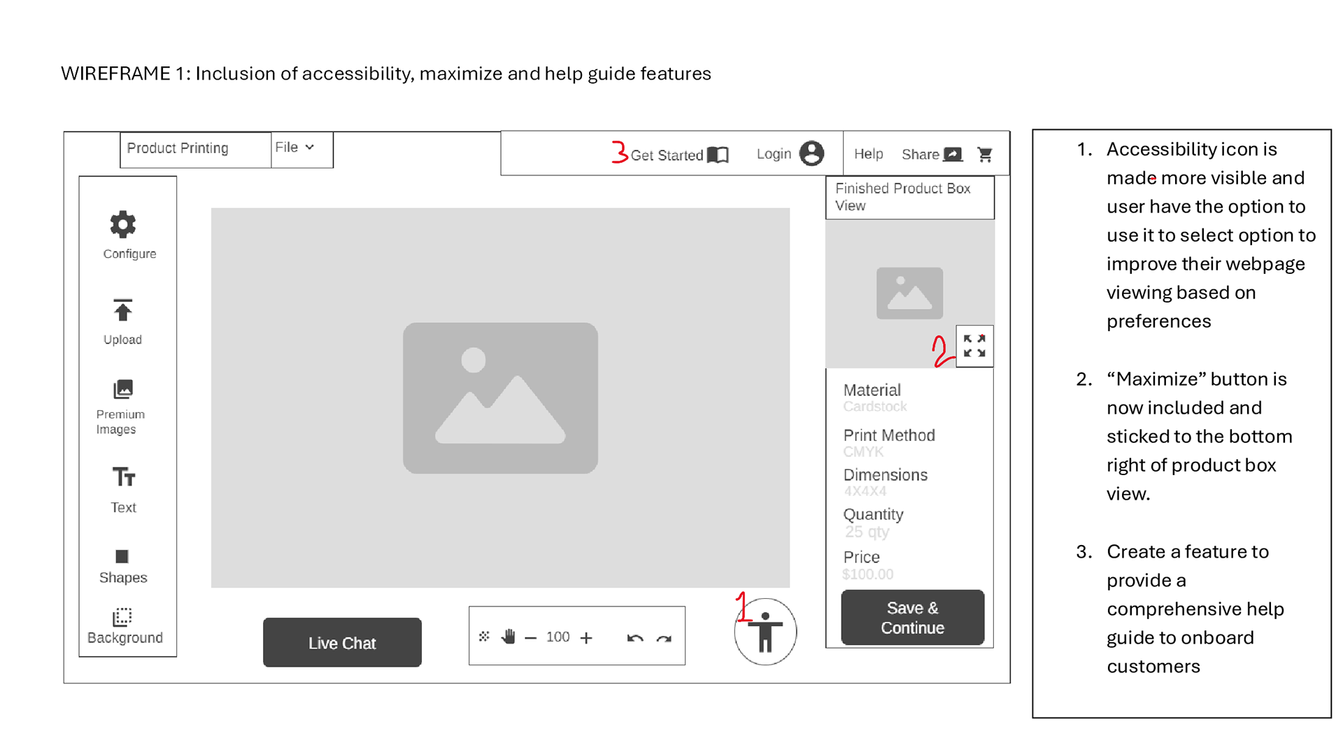
• Finding the maximize icon/button to increase the layout of the product package
• The site doesn’t provide a comprehensive help guide to onboard customers onto the editor’s overall features
• A more visible option for accessibility features isn’t present
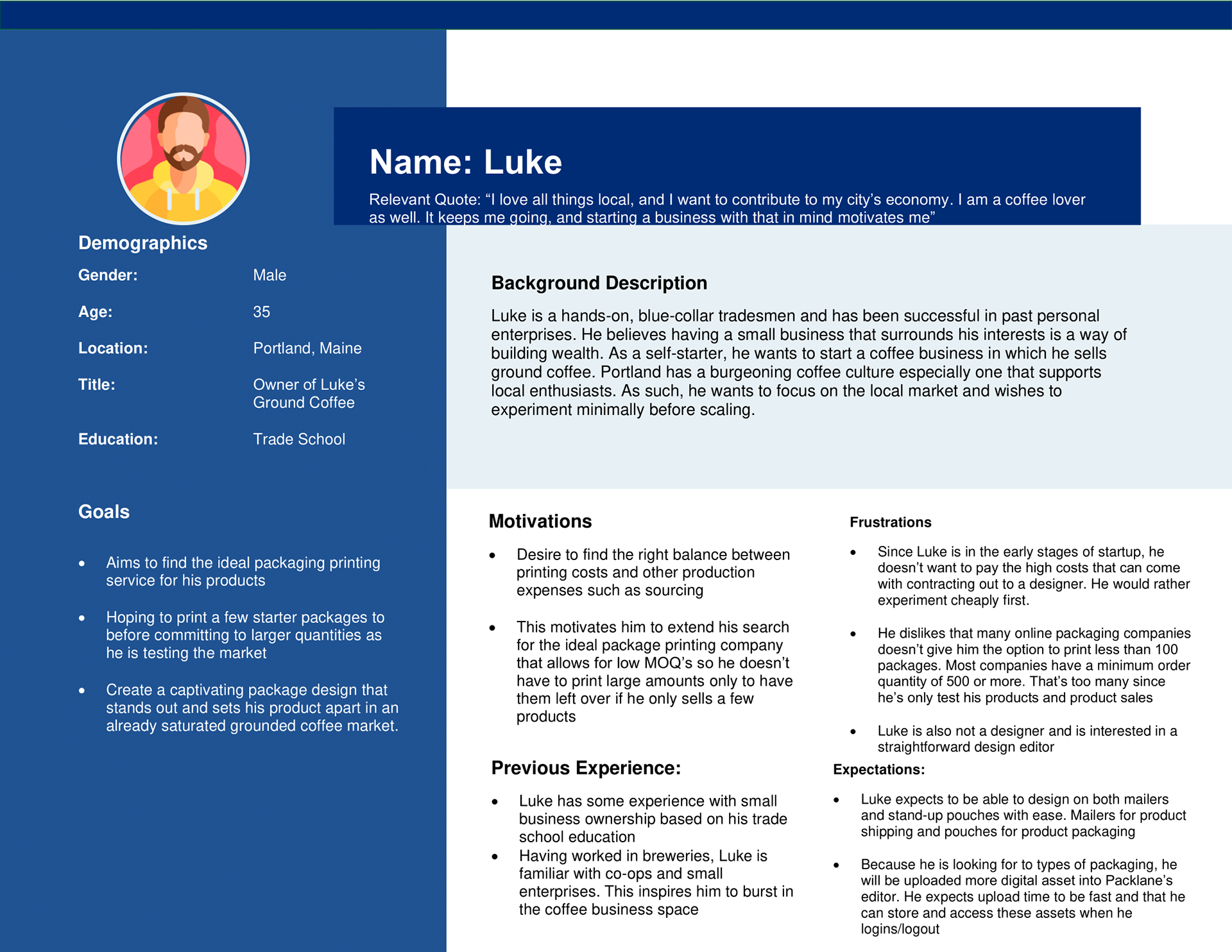
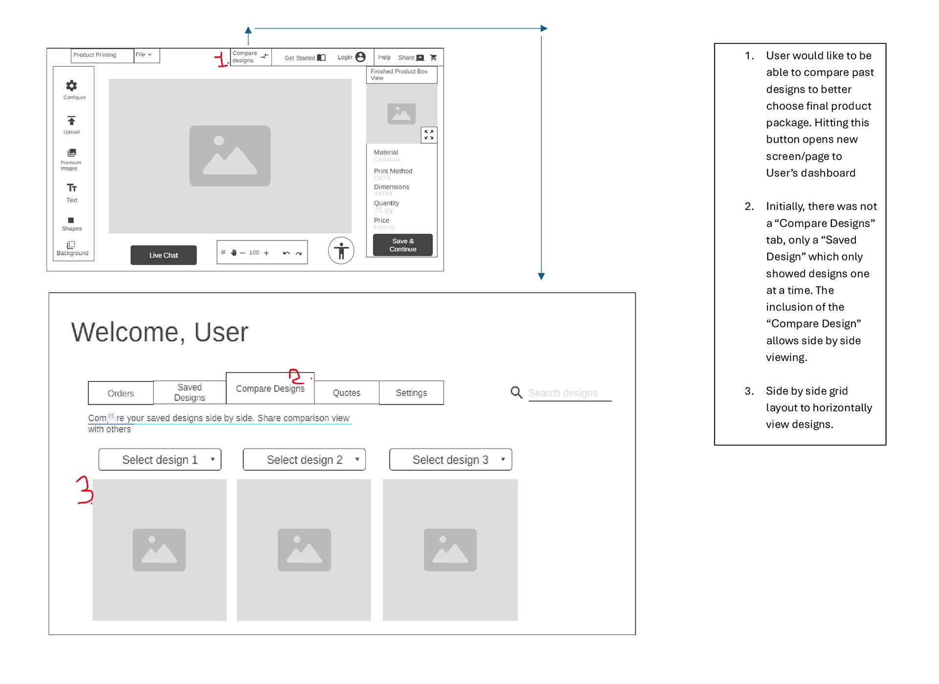
• There is a user expectation that comparing multiple designs will facilitate design choice and preferability so creating a feature where they may be able to compare past designs. (see proto personas below)
• Finding the maximize icon/button to increase the layout of the product package
• The site doesn’t provide a comprehensive help guide to onboard customers onto the editor’s overall features
• A more visible option for accessibility features isn’t present
• There is a user expectation that comparing multiple designs will facilitate design choice and preferability so creating a feature where they may be able to compare past designs. (see proto personas below)
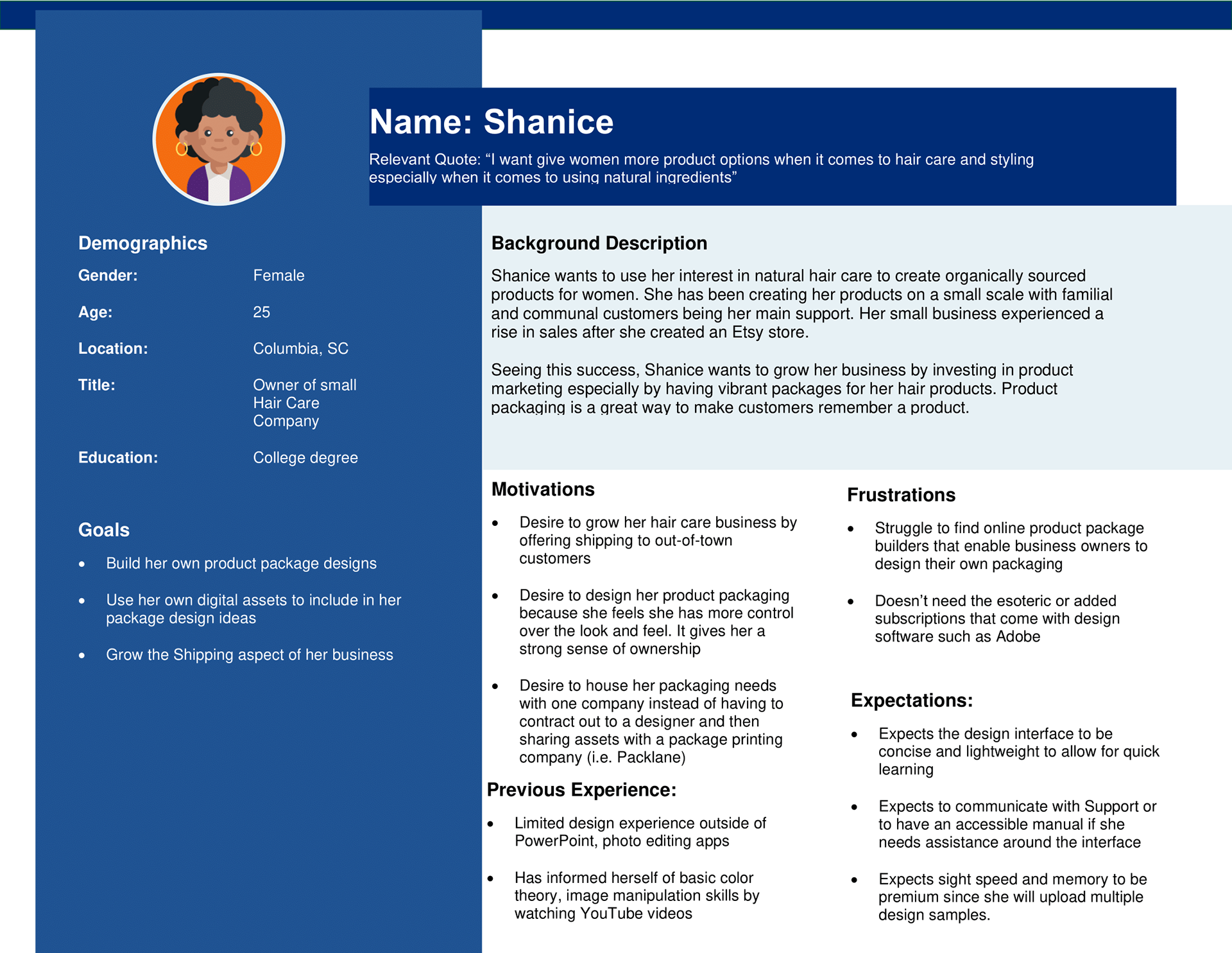
PROTO PERSONAS
To set out to developing personas associated with the use of the site's design editor, first a lightweight approach is devised. This allows for the alignment of general assumptions about the users and for getting a bird's eye view of their desires.
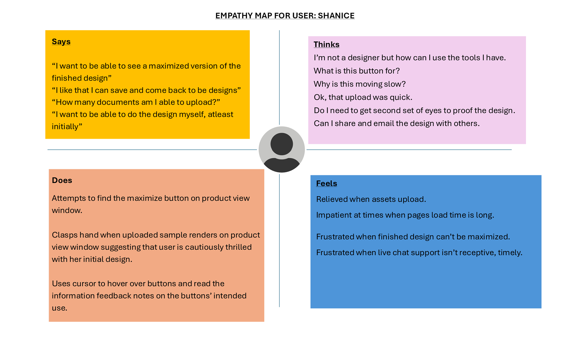
Empathy Map
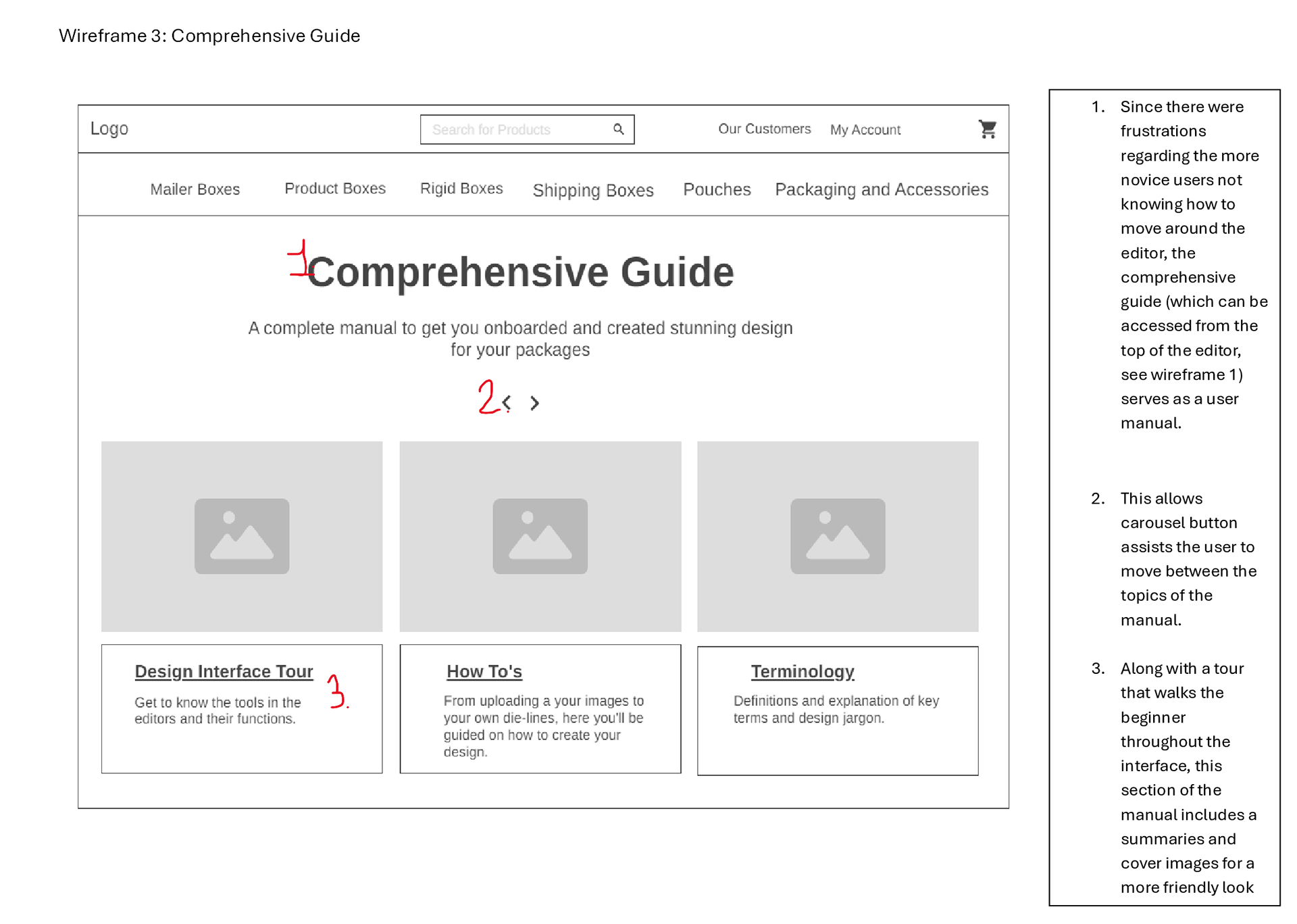
LO-FIDELITY WIREFRAMS HIGHLIGHTING THE AREAS OF IMPROVEMENT WITH CALLOUTS
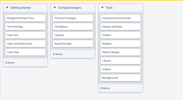
CLOSED CARD SORT CONDUCTED
In this stage, a closed card sort was conducted to capture users' expectation and mental models on how the editor's information architecture was supposed to look and feel in their view.
This was an in-person, closed card sorting exercise.
Consequently, the categories and sub-categories were labeled.
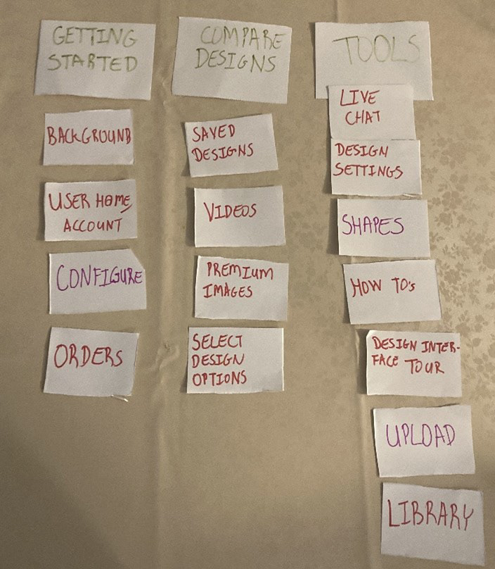
Figures: Set up of categories/sub categories (left)
This was an in-person, closed card sorting exercise.
Consequently, the categories and sub-categories were labeled.
Figures: Set up of categories/sub categories (left)

User 1
During card sorting, User 1 verbally expressed their thought process. It took some time for the user to contextualize the “Upload”, “Videos” and “Library” cards describing them as a bit vague. The user also opined that “Design Settings” and “Live Chat” could have meanings satisfying both the “Getting Started” and “Tools” categories. The User also verbally expressed to themselves that the “Orders” card could apply to both the “Compare Designs” and “Getting Started” categories.
During card sorting, User 1 verbally expressed their thought process. It took some time for the user to contextualize the “Upload”, “Videos” and “Library” cards describing them as a bit vague. The user also opined that “Design Settings” and “Live Chat” could have meanings satisfying both the “Getting Started” and “Tools” categories. The User also verbally expressed to themselves that the “Orders” card could apply to both the “Compare Designs” and “Getting Started” categories.
User 2
This user verbally expressed that “Orders” card is a bit vague. Additionally, they verbally noted that “Videos” card could be placed in all three categories.
This user verbally expressed that “Orders” card is a bit vague. Additionally, they verbally noted that “Videos” card could be placed in all three categories.
Discovery
As it relates to similarities and patterns, both users highlighted that ambiguity is a characteristic of a few of the sub-categories. This may highlight some need to rethink naming conventions for menu items. User 1 expressed more external thoughts as they organized the deck. User 1 also had slightly more experience with design software tools as opposed to User 2. This is valuable insight especially since Packlane’s proto-personas (Shanice and Luke) were markedly beginners to designing product packages. They had stated that a facilitative interface is paramount for them. Seeing User 2 card sorting informs the mental modeling for this user base. This was reflected in the fact User 2 took more time to organize and sort their cards.
Changes that were considered are:
- Consider making the Tools menu drop down (along with a sticky feature for users that may want to keep that component on) so the design canvas may be more minimalistic and less “packed” for new uses who may be initially overwhelmed especially regarding navigation.
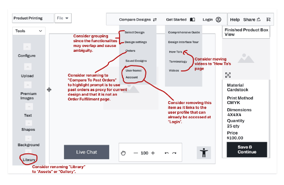
- Consider making sub-categories less ambiguous. For example, “Videos” may be renamed to “How-to Videos” or, since there is already a “How To” subcategory, consider incorporating “Videos” into that subcategory. “Library” may also be changed to something like “Gallery” or “Assets” to specify that the latter is for already uploaded digital and creative assets. It is also worth considering grouping “Design Settings” and “Select Design Options” into one sub-category to further reduce ambiguity or overlap of functionalities. See below for further illustration:
As it relates to similarities and patterns, both users highlighted that ambiguity is a characteristic of a few of the sub-categories. This may highlight some need to rethink naming conventions for menu items. User 1 expressed more external thoughts as they organized the deck. User 1 also had slightly more experience with design software tools as opposed to User 2. This is valuable insight especially since Packlane’s proto-personas (Shanice and Luke) were markedly beginners to designing product packages. They had stated that a facilitative interface is paramount for them. Seeing User 2 card sorting informs the mental modeling for this user base. This was reflected in the fact User 2 took more time to organize and sort their cards.
Changes that were considered are:
- Consider making the Tools menu drop down (along with a sticky feature for users that may want to keep that component on) so the design canvas may be more minimalistic and less “packed” for new uses who may be initially overwhelmed especially regarding navigation.
- Consider making sub-categories less ambiguous. For example, “Videos” may be renamed to “How-to Videos” or, since there is already a “How To” subcategory, consider incorporating “Videos” into that subcategory. “Library” may also be changed to something like “Gallery” or “Assets” to specify that the latter is for already uploaded digital and creative assets. It is also worth considering grouping “Design Settings” and “Select Design Options” into one sub-category to further reduce ambiguity or overlap of functionalities. See below for further illustration:
USER FLOW DIAGRAM AND UPDATED WIREFRAMES
Part 1
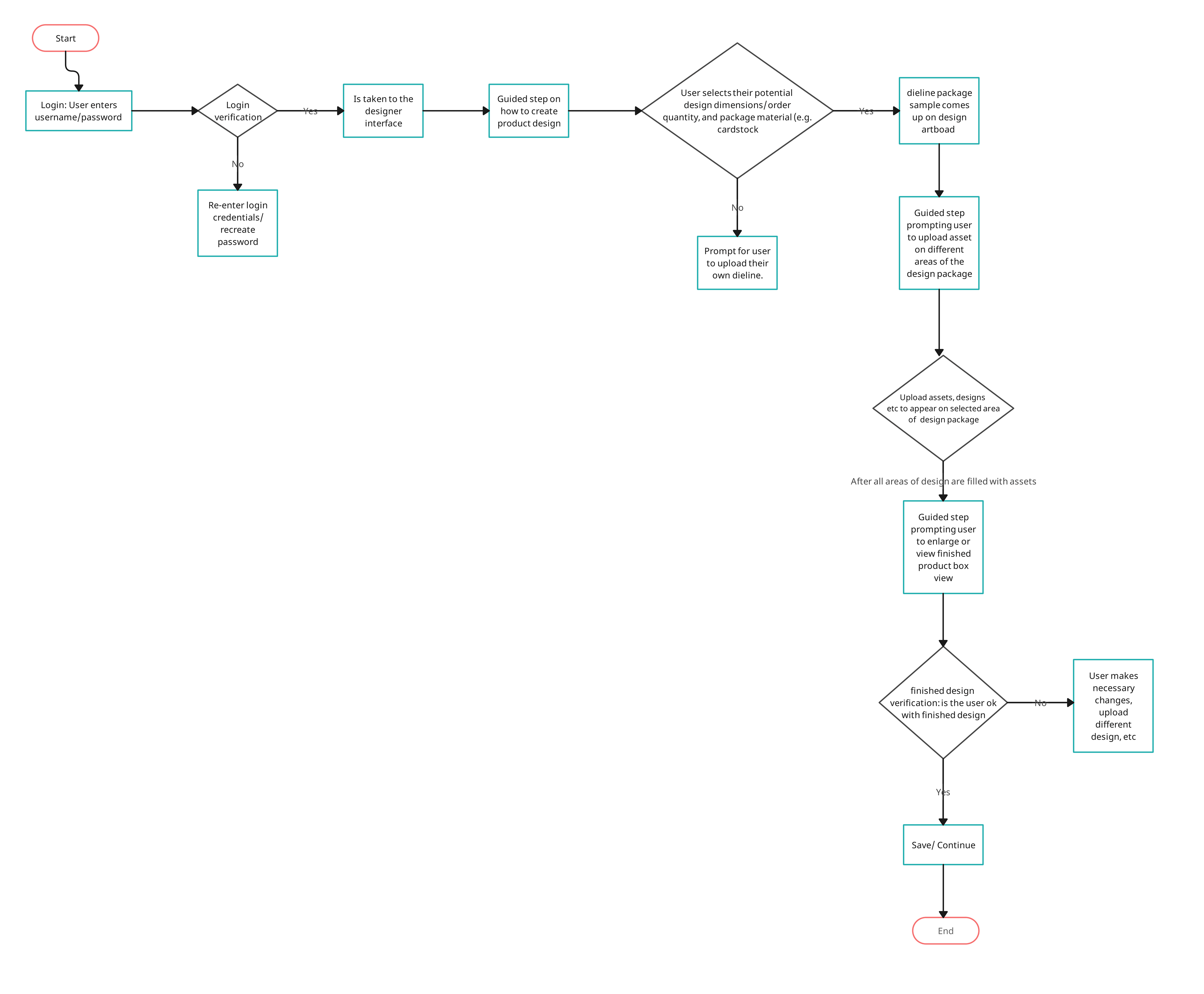
The user flow diagram below showcases the steps that the user takes to build a simple product design. This diagram highlights how the user logs in and then can start their work. However, if the user does not log in successfully, they are prompted to retry or recreate whichever credential that may be incorrect. The medium fidelity wireframe below shows the login, the homepage and the design interface.
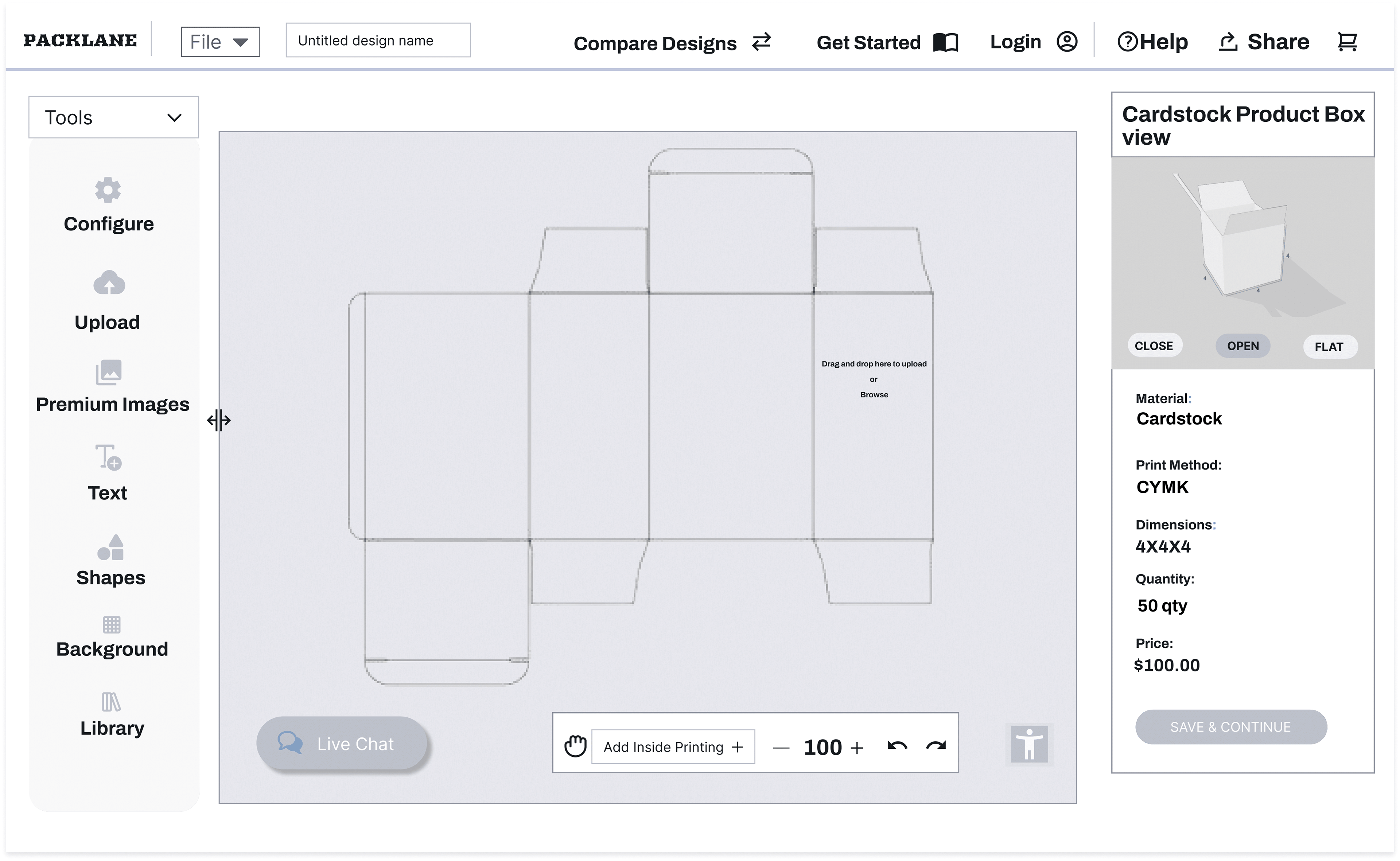
As the user flows through the process, they are prompted to select the product package details such as dimensions. If this is not satisfied, it branches of to the process by which the user may upload their own byline. Nonetheless, if the user chooses a dimension of 4 x 4 x 4, the dieline appears on the art board as illustrated on the 3rd wireframe.
Then, after the user is finished with their design, they can finalize it by expanding the finished product view and hitting “save and continue”. If not, return to make additional changes are assumed.
In terms of improvements, a login section in the process flow is added which is reflected in the wireframe in Part 2. Additionally, a sample box is highlighted to view what the designing process would look like in 3d. The categories and subcategories from the card sort are also added in the final wireframe.
The user flow diagram below showcases the steps that the user takes to build a simple product design. This diagram highlights how the user logs in and then can start their work. However, if the user does not log in successfully, they are prompted to retry or recreate whichever credential that may be incorrect. The medium fidelity wireframe below shows the login, the homepage and the design interface.
As the user flows through the process, they are prompted to select the product package details such as dimensions. If this is not satisfied, it branches of to the process by which the user may upload their own byline. Nonetheless, if the user chooses a dimension of 4 x 4 x 4, the dieline appears on the art board as illustrated on the 3rd wireframe.
Then, after the user is finished with their design, they can finalize it by expanding the finished product view and hitting “save and continue”. If not, return to make additional changes are assumed.
In terms of improvements, a login section in the process flow is added which is reflected in the wireframe in Part 2. Additionally, a sample box is highlighted to view what the designing process would look like in 3d. The categories and subcategories from the card sort are also added in the final wireframe.
Part 2
Below is an updated wireframe showcasing incorporating the results of the card sort and the user flow above.
Below is an updated wireframe showcasing incorporating the results of the card sort and the user flow above.
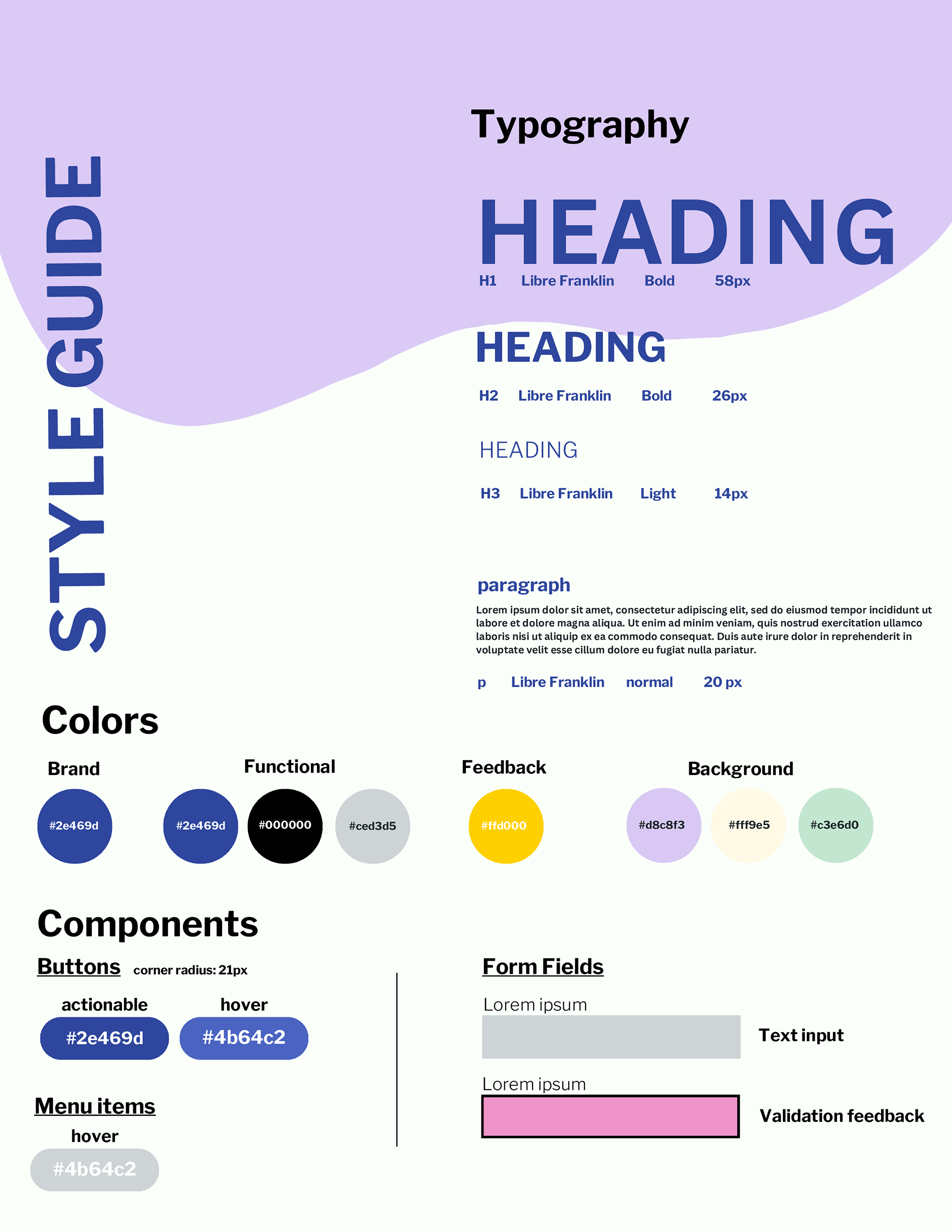
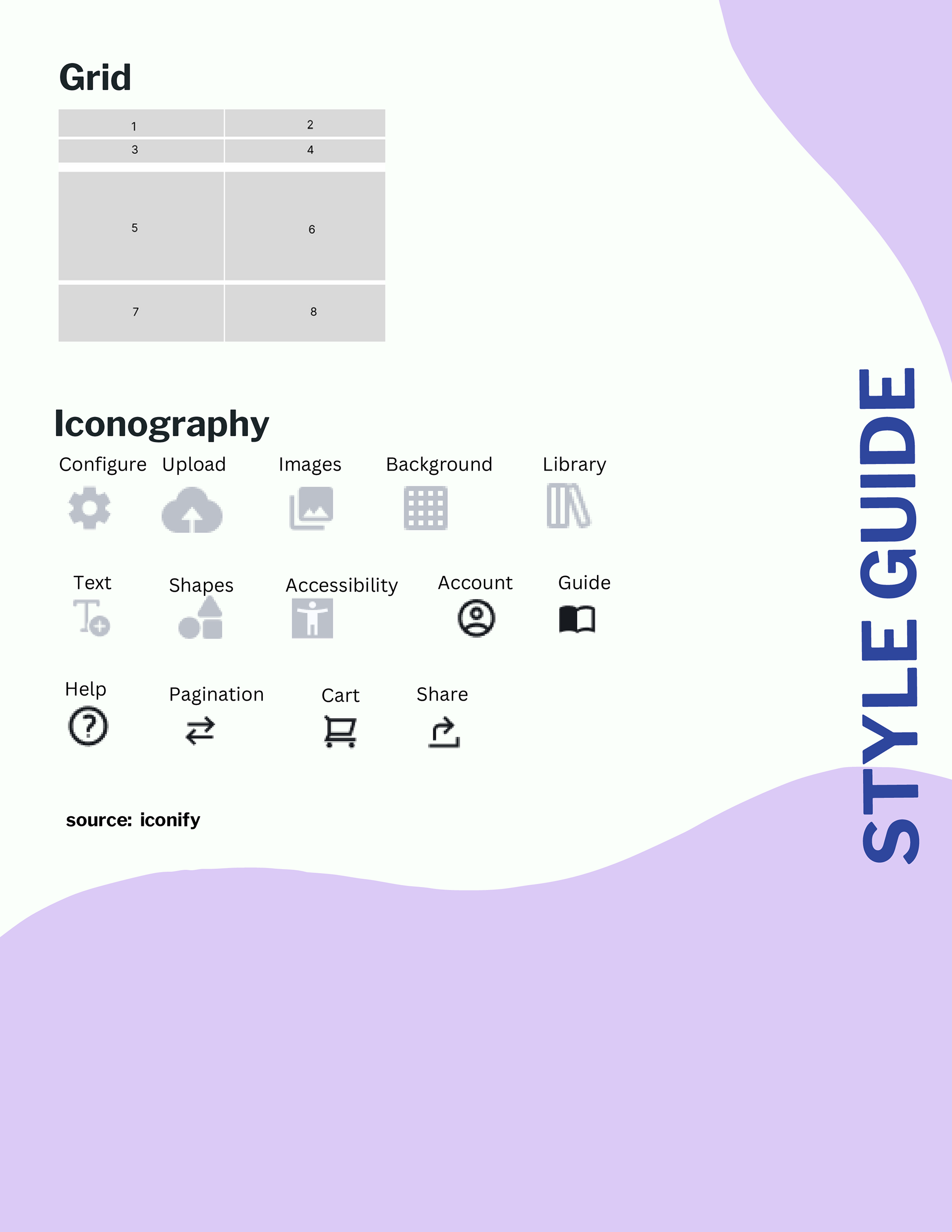
Preliminary UI Style Guide
Below is the style guide that documents the elements, components and categories for the PackLane site redesign. It includes the typography, color palette, components such as buttons, the general grid system and iconography. Basically, the foundations. The style was sourced from PackLane’s website using the browsers Developer Tools. The iconography is also sourced from Iconify library.